Tuesday, May 13, 2008

Watercolor Final


I really liked this one. The whole time I was working on it, I just wasn't diggin it. I knew that compositionally, the layout was good, but the colors just weren't doing it for me, but once I did the sky (saved that for last), I think it really came together nicely. I'm pretty happy with it, which is not something that happens often. What do you think?

Tuesday, May 6, 2008

the dark side of design


It's about how graphic design fuels consumerism and propaganda.

to the internet: ur gay

Look at my post below and look at the entry below and the look at the comment it got. thanks for making my point for me.

Wednesday, April 23, 2008

I'm getting really irritated with spam comments. Blogger needs to find a way to get rid of it. I hate checking my comments only to see some goober has hit it up with a fat slice of spam. Bite me internet.

Monday, April 7, 2008

High Design Street Art


This is a mixture of street art/graffiti and high end design. Both are forms of art that flourish in the big cities, but are associated with completely different social classes.

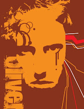
Yes, that is my face.

Unfortunately, there is some glare in there off the high gloss spray paint, and I'm too lazy to photoshop it out. Enjoy.

Saturday, March 15, 2008


bored


reductive illustration logo for special studies

Saturday, March 8, 2008

the technological nature of design


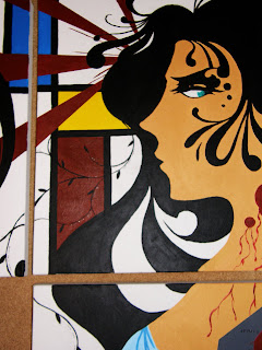
This is the triptych I did for drawing and painting (Acrylic + ink). The concept is organic vs inorganic, technology vs nature, and how that conflict relates to me as a graphic designer. As a designer growing up in the computer age, I, as well as my peers in the design department, have grown to rely heavily on the computer. i have been experimenting with Art Nouveau as well as De Stijl...two completely opposing art forms. One reich with curves, contours, and sinuous lines. The other gridlike and geometric. Also the missing canvas demonstrates Gestalt, a common design technique that leaves out some information and lets your mind fill in the gaps. Also, the number 3 (number of canvases) and their layout, is symbolic of asymmetrical design, which incorporates three focal points. Binary code is also scattered throughout the piece. Please drop a line. Let me know what you think. Thanks.

the finals of the 300+ logos I made


We made 300, count em 300 logos for Drew's special studies class. Here are the final picks, chosen by classmates and John Drew himself.

axis ministries business card


3 fronts and 2 backs for my friend Donovan's start-up ministry.

Wednesday, December 12, 2007

album art


just some album art I did for fun. The new girl at work sings for a band. Pretty cool music. Due to my graphic design geekiness, yonder covers were brought into being.

Tuesday, December 11, 2007

Looking 4ward 2 next semester already


This is one of the project options for John Drew's special studies class. Oh boy

Wednesday, November 28, 2007

Monday, November 26, 2007

Sunday, November 4, 2007

Thursday, November 1, 2007

Friday, October 26, 2007

Thursday, October 25, 2007