Hey everyone, my web portfolio is now up. Unlike my blog, this site's layout has been designed by me, and features only my portfolio quality work. It is split into three sections: design, illustration, and painting. I still have a few kinks to work out, namely, removing the Godaddy banner that keeps ruining the proper layout of the page, but until then, if you are interested, go check it out.
www.ryanoliverdesign.com
Monday, December 15, 2008
Tuesday, December 9, 2008

Sunday, December 7, 2008
Smoking painting

Smoking has always been a major stumbling block for me. If I get a whiff of it, or get really stressed out, I feel that it too often becomes a big temptation. (I smoked about a half pack a day for over 5 years and quit about a year and a half ago) Thus, in light of this I created this painting. I'm working on another piece to complement it, which looks at smoking on the global scale which will be posted soon. In the meantime, enjoy.
CD Packaging XTREME


I built this out of basswood strips and 1/8" birch plywood. I then put an African mahogany veneer over the top. "Rebelution" is spray paint stencil. and the leaves are a handmade paper adhered to the surface of the wood. The cover slides out, then rotates, revealing the sleeve containing an accordion fold booklet.
Tuesday, November 25, 2008
waterverf nummer twee, drie, vier, vijf, en zes


I still have to do some work on just about all of these, but here they are anyway.
Saturday, November 1, 2008
CD packaging comp 1


I'm going to build the case out of wood. The type on the front, I'll spray stencil. The leaves and song list will be wheat pasted with newsprint or handmade paper. I think I'll stain the reggae stripes.
Sunday, October 19, 2008
Another bag

This is the second bag. It started off as a joke...a bag designed for sandpeople from Star Wars. However, after much consideration and 6 hours of labor actually making the bag, I decided not to be stupid and make something worthwhile and constructive. I even shot it at a classic "myspace" angle to make it look approximately 152% better than it does in real life. (no not really). All nonsense aside, please tell me what you think.
Friday, October 17, 2008
waterverf nummer een

First illustration for Cramp. Love it, Hate it, despise it from the bowels of your soul, let me know.
Wednesday, October 15, 2008
Painting for the Church

I did this in my drawing & painting class, but it is for my church. The idea is clear, but I'm about 80% satisfied with the composition itself. My biggest gripe is that the cross doesn't stand out enough.
Shopping Bag Mach 2


These are the supercomps for the second version of the shopping bag. I made the stencils on the computer, but the entire bag was done with spray paint...no printing involved.
Thursday, October 2, 2008
graffiti shopping bag

This is my comp for a graffiti shopping bag. the front of the bag will be shaped like a spray paint can. The black face will be cut out, so the bag can also be used as a graffiti stencil. Also, the shop name "tagrz" will not be printed but spray painted on with a stencil itself...anyway tell me what you think.
Friday, September 26, 2008


Saturday, September 20, 2008
teh brute
I ripped just about all the phone books we have. This one was a little more difficult for some reason.
urgurghurghrughgurhg urg...
Thursday, September 18, 2008
newsletter masthead

this is what I have so far. let me know what you think, so i can make changes before it's due.
Saturday, September 13, 2008


Wednesday, September 10, 2008
Political posters


Political posters for Moore's Special Studies class. They're die cuts, so the poster is acutally the shape of the word/thought bubble.
Sunday, August 17, 2008


Thursday, July 31, 2008
women's ministries design


This was a banner I did for the head of women's ministries at my church for a conference they are having. She was ecstatic.
Tuesday, July 8, 2008
Art Nouveau Watercolor


I think I might have made the watercolor too opaque, or maybe it's just the wrong medium for such a graphic piece, but I kinda like it anyway.
Tuesday, May 13, 2008
Watercolor Final

I really liked this one. The whole time I was working on it, I just wasn't diggin it. I knew that compositionally, the layout was good, but the colors just weren't doing it for me, but once I did the sky (saved that for last), I think it really came together nicely. I'm pretty happy with it, which is not something that happens often. What do you think?
Tuesday, May 6, 2008

to the internet: ur gay
Look at my post below and look at the entry below and the look at the comment it got. thanks for making my point for me.
Wednesday, April 23, 2008
Monday, April 7, 2008
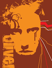
High Design Street Art

This is a mixture of street art/graffiti and high end design. Both are forms of art that flourish in the big cities, but are associated with completely different social classes.
Yes, that is my face.
Unfortunately, there is some glare in there off the high gloss spray paint, and I'm too lazy to photoshop it out. Enjoy.
Saturday, March 29, 2008

Saturday, March 15, 2008


Saturday, March 8, 2008
the technological nature of design


This is the triptych I did for drawing and painting (Acrylic + ink). The concept is organic vs inorganic, technology vs nature, and how that conflict relates to me as a graphic designer. As a designer growing up in the computer age, I, as well as my peers in the design department, have grown to rely heavily on the computer. i have been experimenting with Art Nouveau as well as De Stijl...two completely opposing art forms. One reich with curves, contours, and sinuous lines. The other gridlike and geometric. Also the missing canvas demonstrates Gestalt, a common design technique that leaves out some information and lets your mind fill in the gaps. Also, the number 3 (number of canvases) and their layout, is symbolic of asymmetrical design, which incorporates three focal points. Binary code is also scattered throughout the piece. Please drop a line. Let me know what you think. Thanks.
the finals of the 300+ logos I made


We made 300, count em 300 logos for Drew's special studies class. Here are the final picks, chosen by classmates and John Drew himself.
Subscribe to:
Posts (Atom)