Saturday, March 29, 2008
Saturday, March 15, 2008
Saturday, March 8, 2008
the technological nature of design


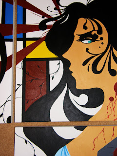
This is the triptych I did for drawing and painting (Acrylic + ink). The concept is organic vs inorganic, technology vs nature, and how that conflict relates to me as a graphic designer. As a designer growing up in the computer age, I, as well as my peers in the design department, have grown to rely heavily on the computer. i have been experimenting with Art Nouveau as well as De Stijl...two completely opposing art forms. One reich with curves, contours, and sinuous lines. The other gridlike and geometric. Also the missing canvas demonstrates Gestalt, a common design technique that leaves out some information and lets your mind fill in the gaps. Also, the number 3 (number of canvases) and their layout, is symbolic of asymmetrical design, which incorporates three focal points. Binary code is also scattered throughout the piece. Please drop a line. Let me know what you think. Thanks.
the finals of the 300+ logos I made
Subscribe to:
Comments (Atom)


