We went with the top one. Could be more conceptual, but, it's interesting I suppose. Painted brush strokes by hand, scan, live trace, lightly fluff, and serve.
This is a t-shirt I designed for my buddy Steve and the team he is going with on a missions trip to Uganda. The proceeds from the shirt sales will help fund their trip.
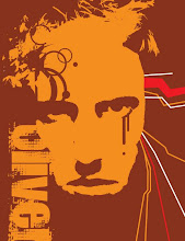
This poster has been on display a while, but I've been forgetting to take a picture. Well, now that I finally did, feel free to take a look. I don't know how much longer it will remain up at CSUF, but you can look at it there too, in all its 14.5" x 26" glass encased glory.
I haven't done one of these in a LOOOOONNGGG time. At least not a serious one since I switched from animation to graphic design. So, over spring break, I figured I would put some of the watercolor and illustration techniques I've learned over the past several semesters to use on some leisure art. The pose is a little stiff...something I still struggle with, but overall, I'm happy with the results. I may do some more down the road...should time permit it.
This is a twin set of posters for grand central art center/ cal state fullerton art galleries. The two fragmented posters will be printed on semi-transparent vellum/parchment and are designed to be able to be displayed individually. However, when placed one over the other, they form the complete image. The motif of the face is derived from art nouveau and pop art which are two of the shows featured during this season ..."redefining the line" and "what's the rush?"
These are spreads for an art book me and a team of three other graphic design students are working on in practicum. These spreads include two cover comps (one being a slightly revised and cleaner version of what last semester's class worked on in preparation for this book). Also, there is a chapter division page, essay page, and basic layout page. These, of course, are prototypes, which will be submitted as possible templates. Let me know what you think.